
Overview
About Lowell
Northwest Arkansas (NWA) is a metropolitan area and region encompassing four of the ten largest cities in the state: Fayetteville, Springdale, Bentonville, and Rogers. It boasts a booming economy, an abundance of employment opportunities, a variety of activities and entertainment, a diverse population, and progressive attitudes.
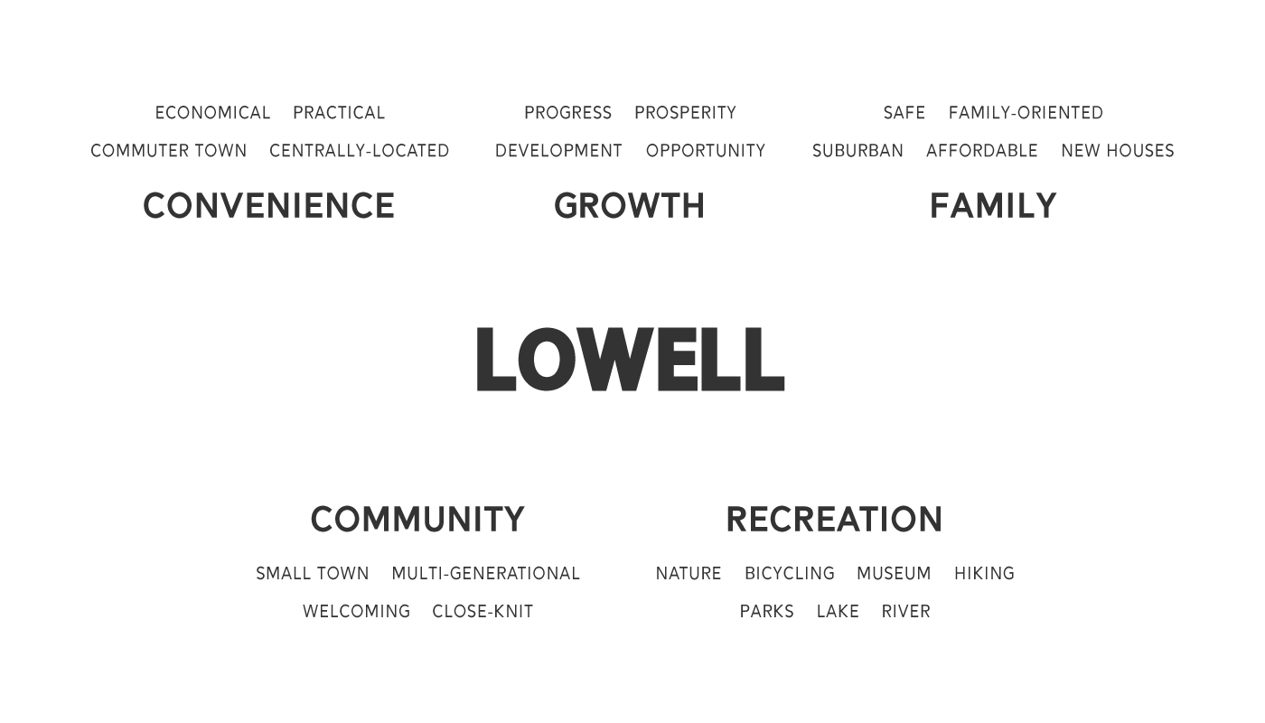
Lowell, Arkansas is a smaller city in NWA that has begun to experience growth of its own. The four principal cities of the region form a rectangle, and Lowell is conveniently located right in the center of it, no more than a 15-minute drive from any of NWA’s major employers or attractions. Its ideal location, abundant housing, affordable cost-of-living, and close-knit community have made Lowell a popular commuter town in the region.
The Problem
Lowell had a reputation as a boring, old-fashioned commuter town, but the city had changed considerably in recent years. It had become a lively city with a close-knit community and ample employment, housing, and entertainment opportunities. Around 2019, NWA's population began rapidly increasing, and Lowell hoped to attract people to the city.
The Solution
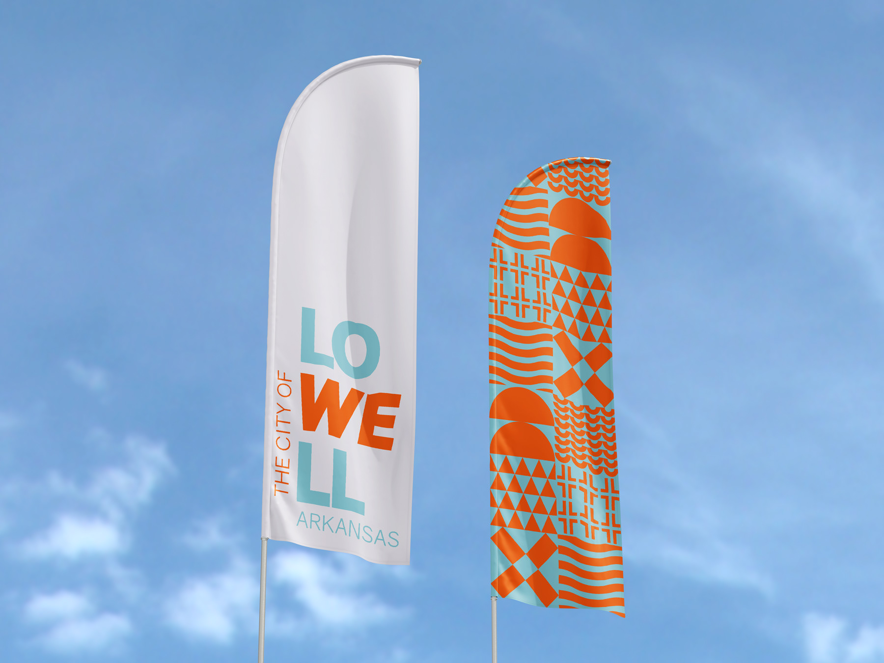
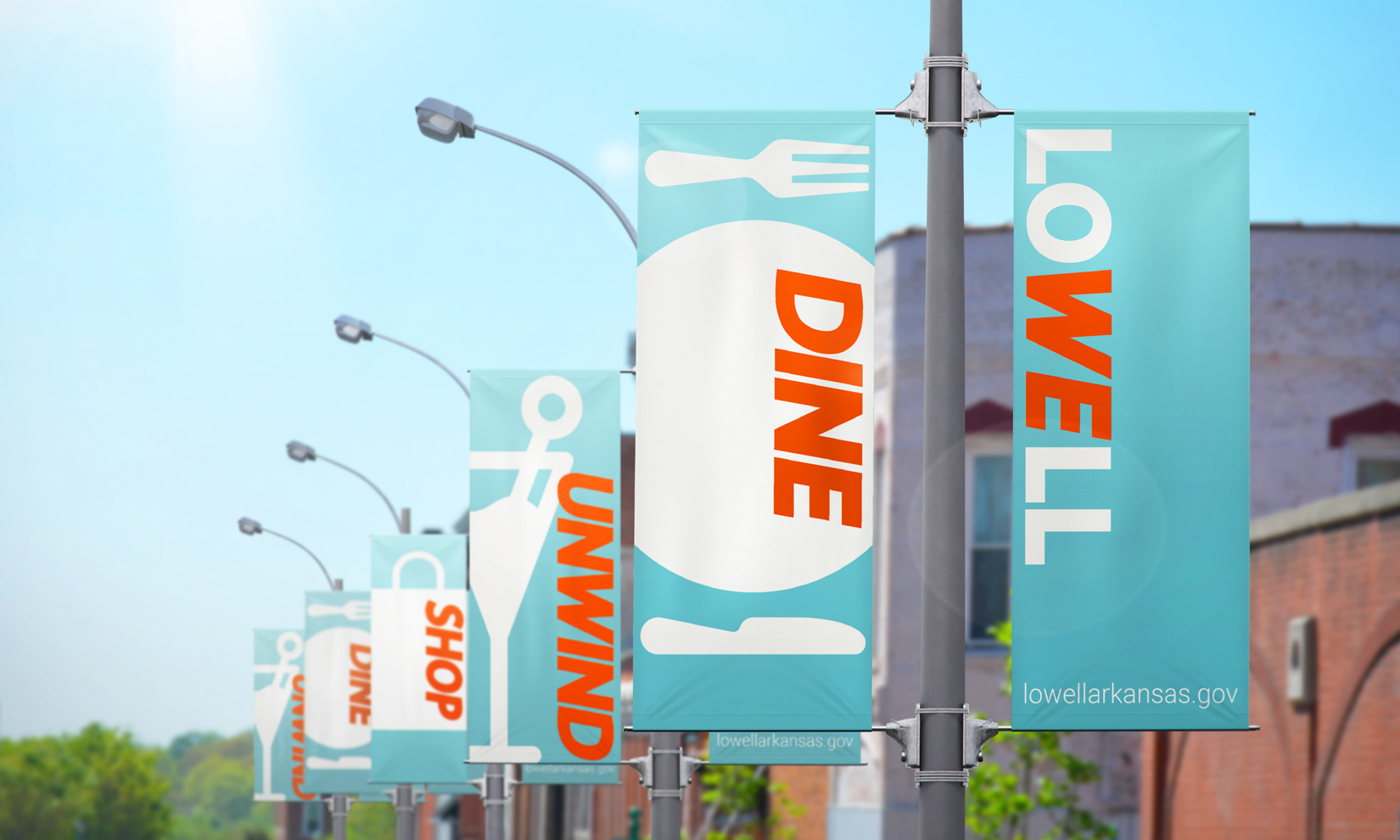
Lowell needed a new logo and visual identity that represented the city not only as a city of convenience, but as a great city to live in.
Logo Design
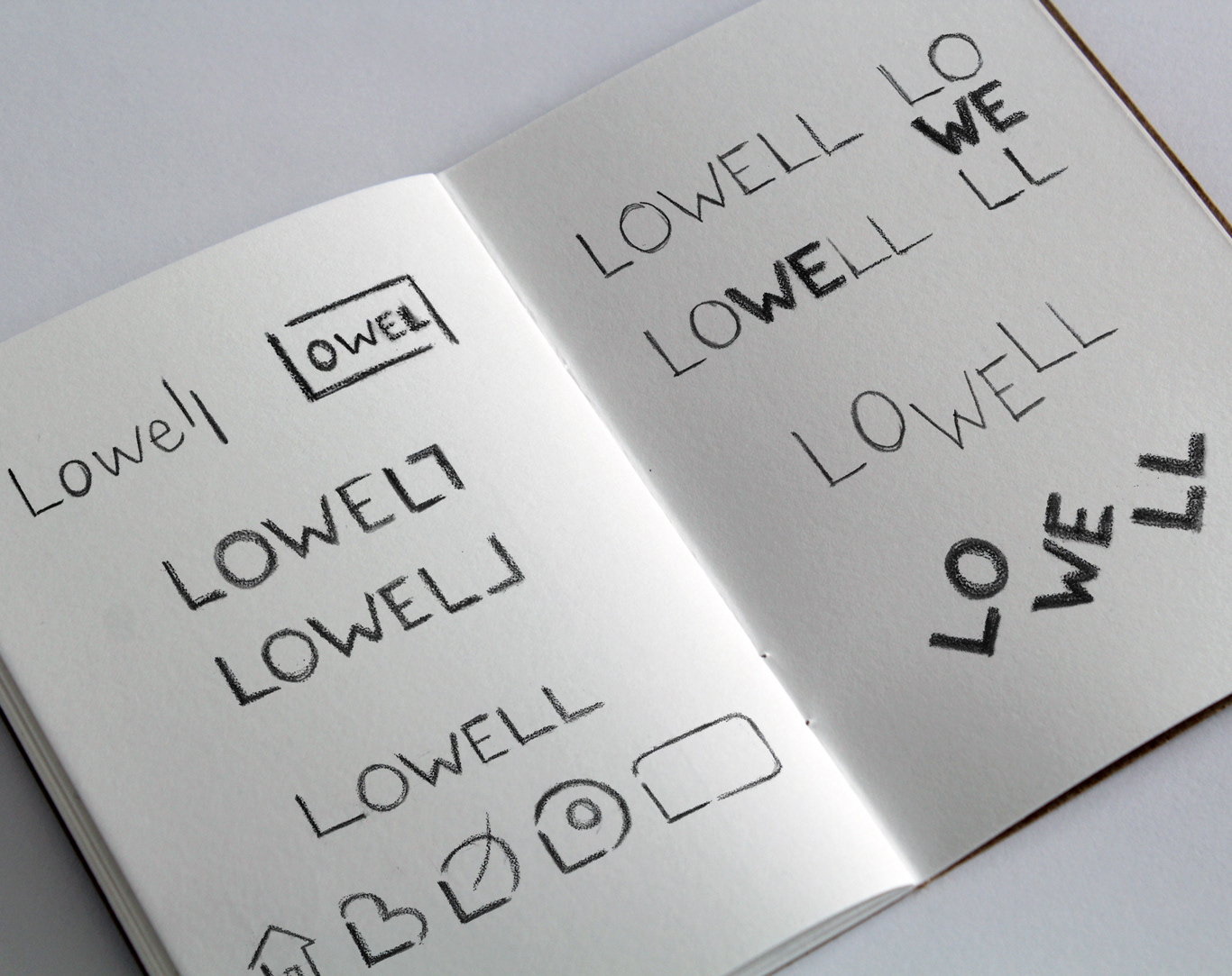
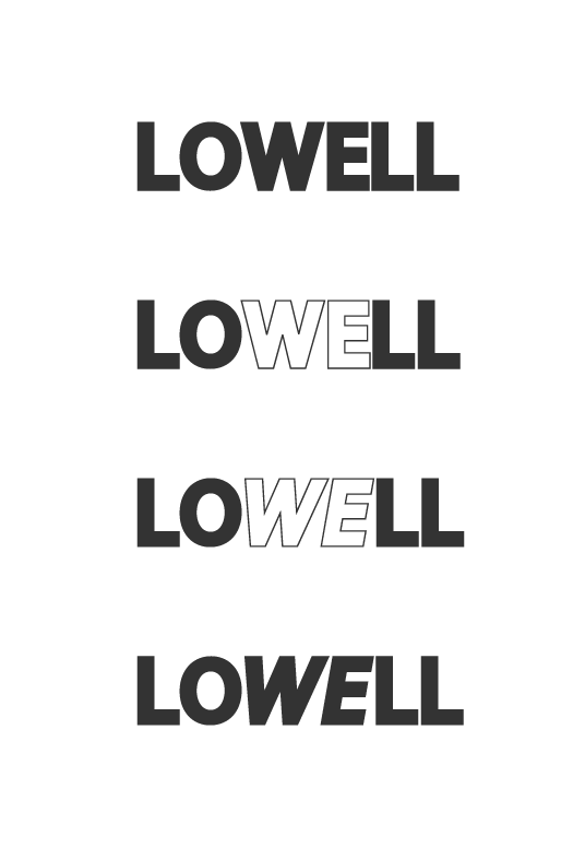
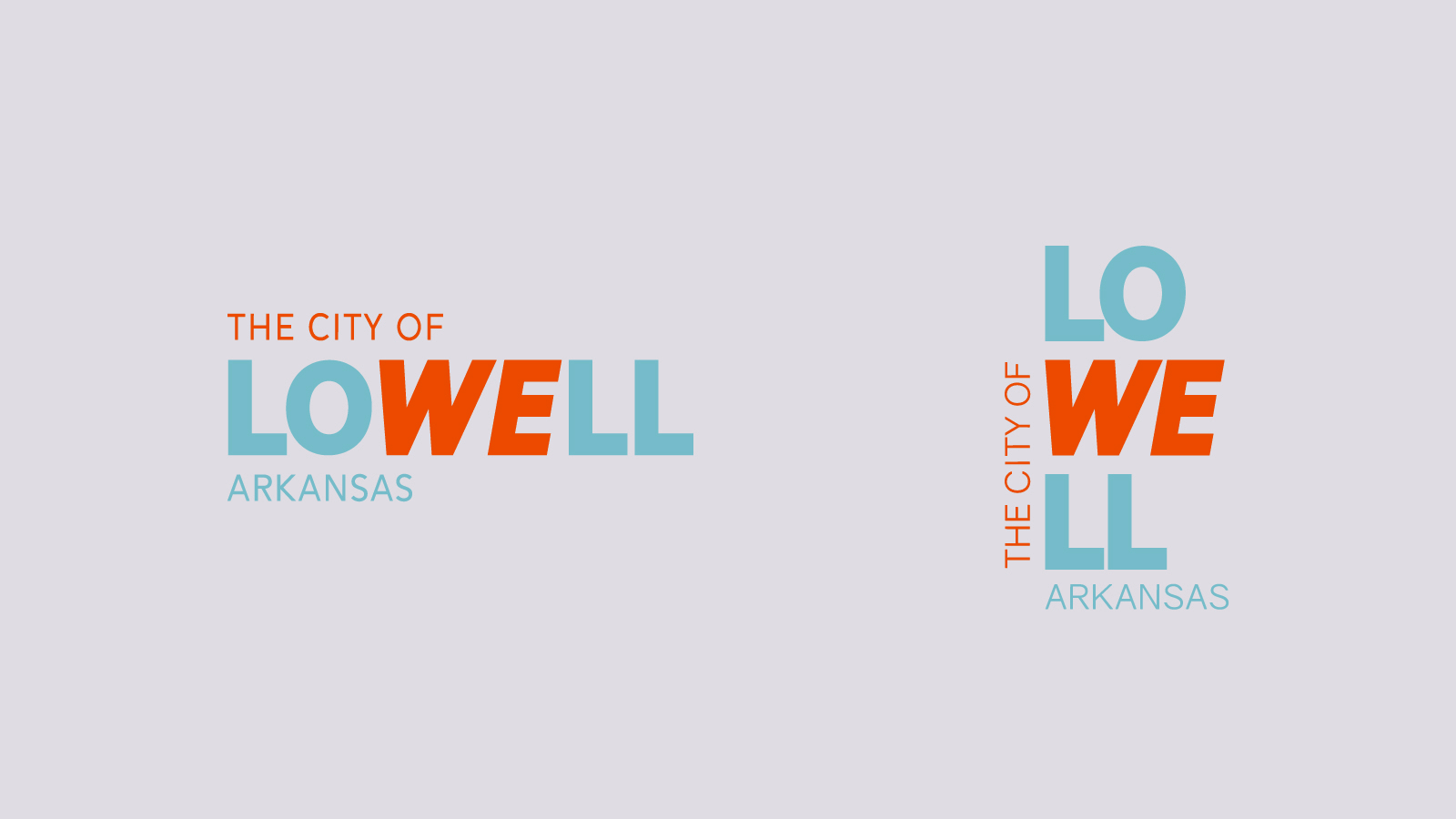
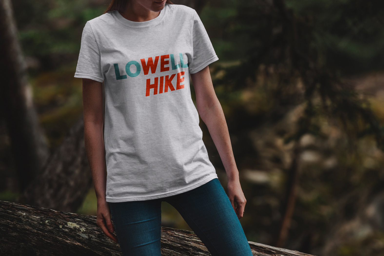
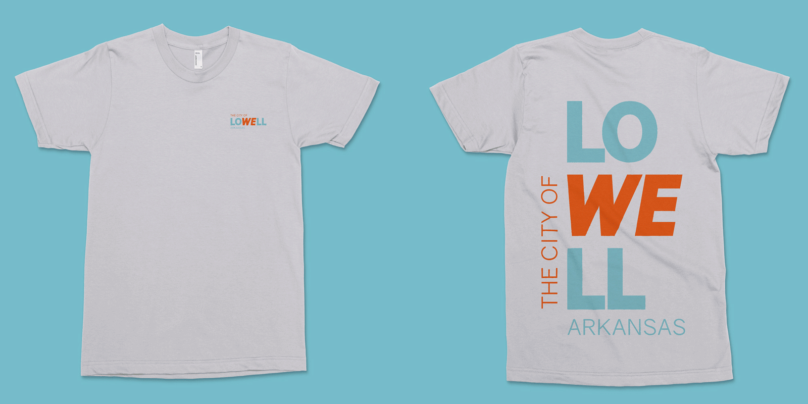
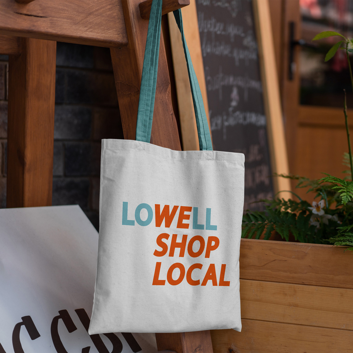
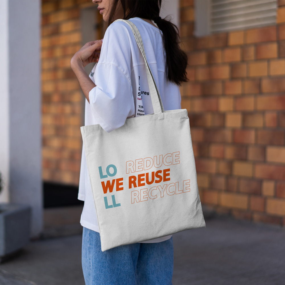
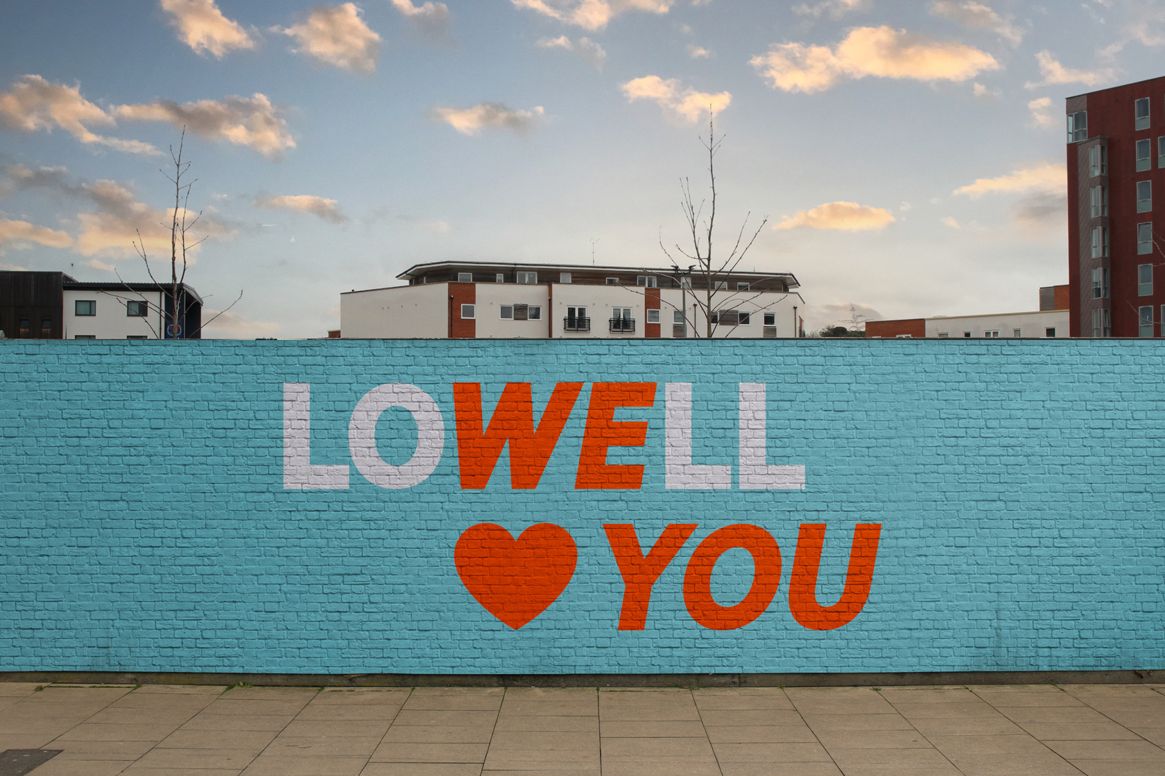
The City of We
With some emphasis on the “we” in “Lowell,” an apt phrase is realized within the logotype: “The City of We.” This expression conveys Lowell’s values as a close-knit community and comes across as welcoming and friendly to newcomers.
Identity Design

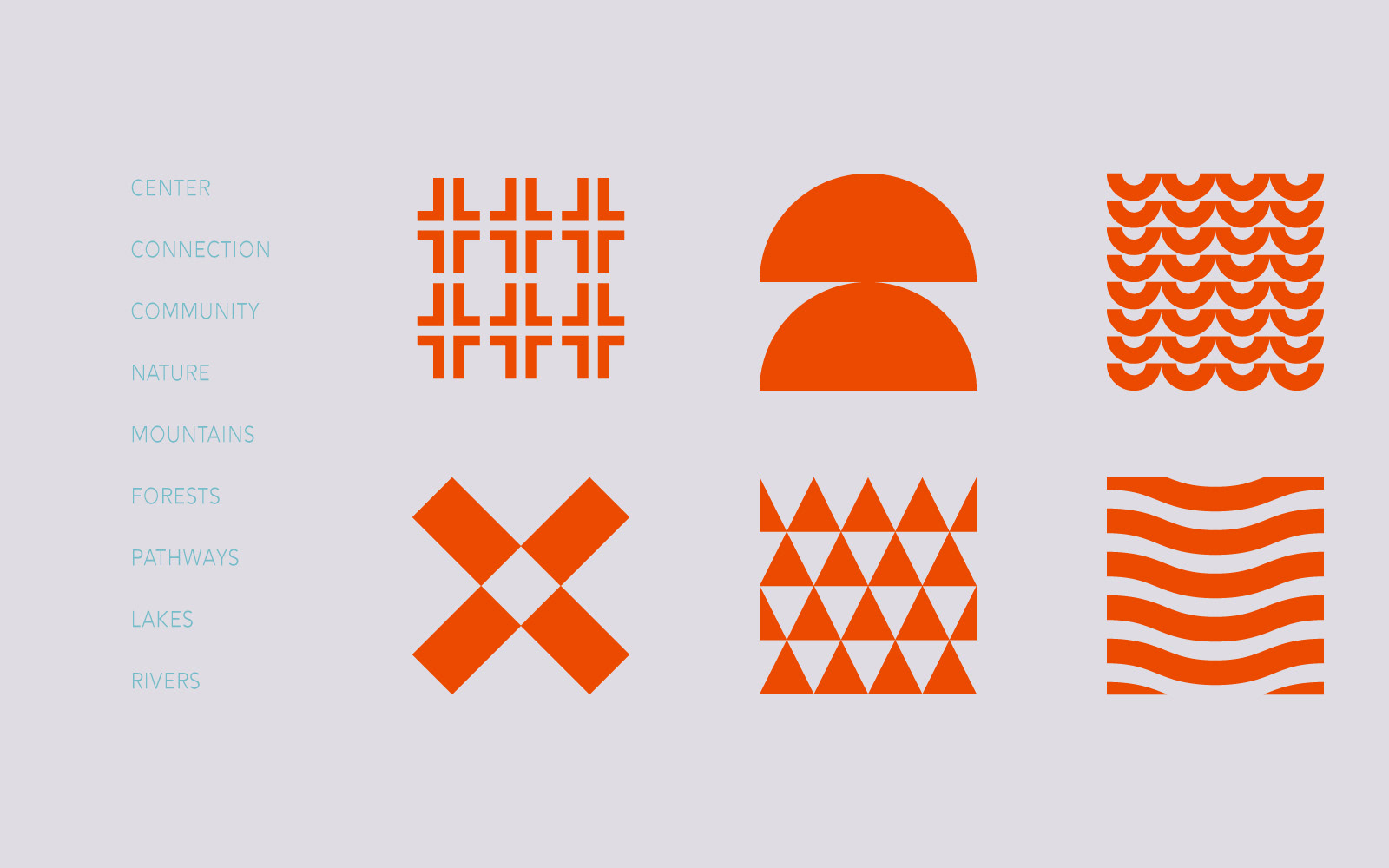
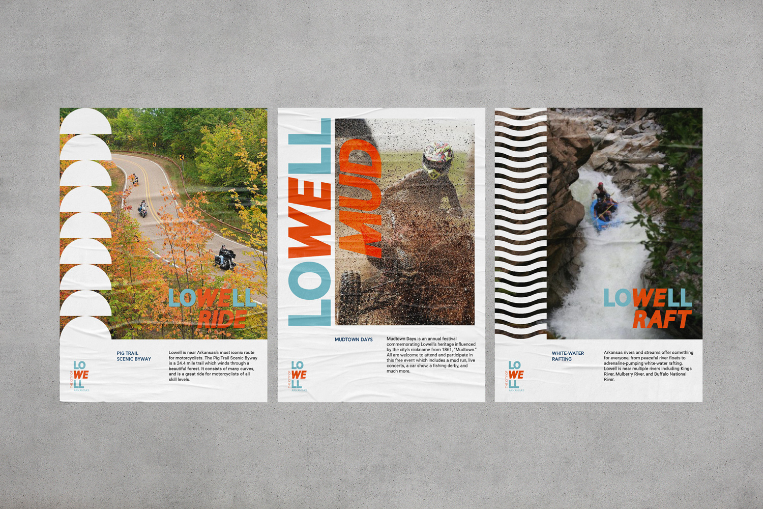
Progressive & Vibrant
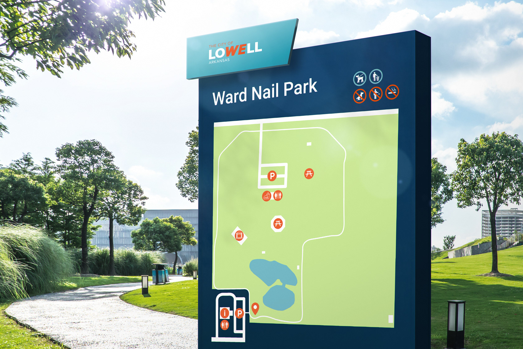
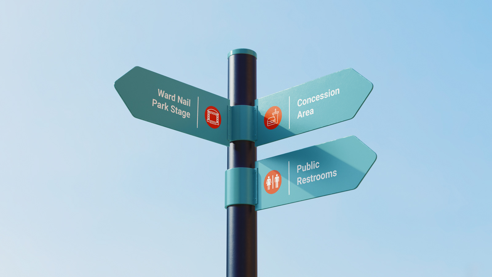
The typography and color palette complement those of NWA’s principal cities while also differentiating Lowell as its own entity.
The primary typeface, Dustin, is informal and exciting. These characteristics are complemented by the stability of the secondary typeface, Alesand.
As for the color palette, light and dark blues are present in the visual identities of each of the four principal cities, but the orange sets Lowell apart. Blue and orange are complementary colors, creating visual vibration and exciting the eye. However, these colors are not only complementary visually, but in terms of their meanings as well. Blue elicits feelings of peace and competence, while orange is associated with friendliness, joy, and excitement.

Contracted By
Orion Global
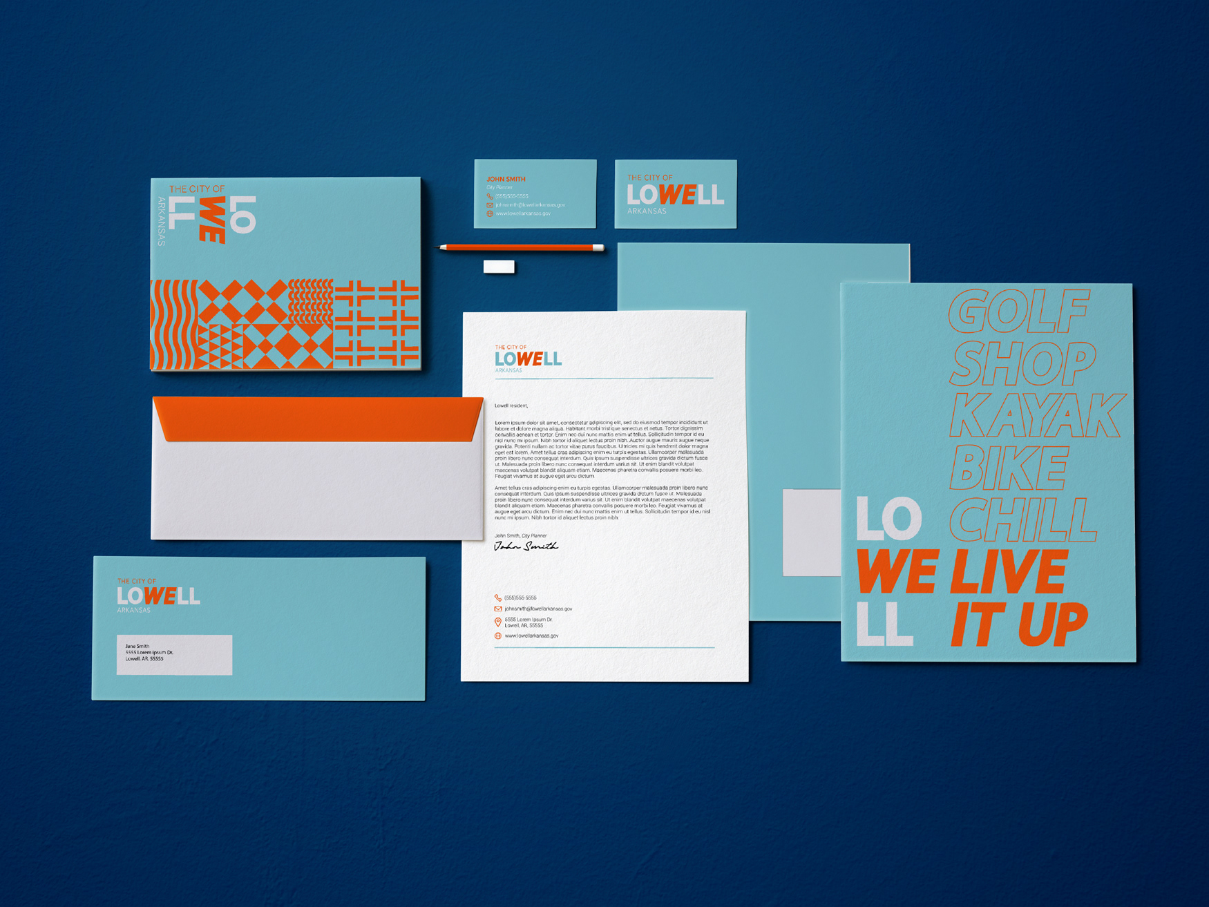
Deliverables
Logo
Identity System
Skills Utilized
Logo Design
Identity Design
Typography
Color Theory
Patter Design